Systems Design Tools
Visual Synthesis Process
A visual method for synthesizing research data. This diagram outlines clear steps to process large data sets, produce structural maps, or draw out insights at the meta level. This method is particularly useful when doing a systems-level analysis that seeks to create systems-level change. To read about the creation of this process click here.
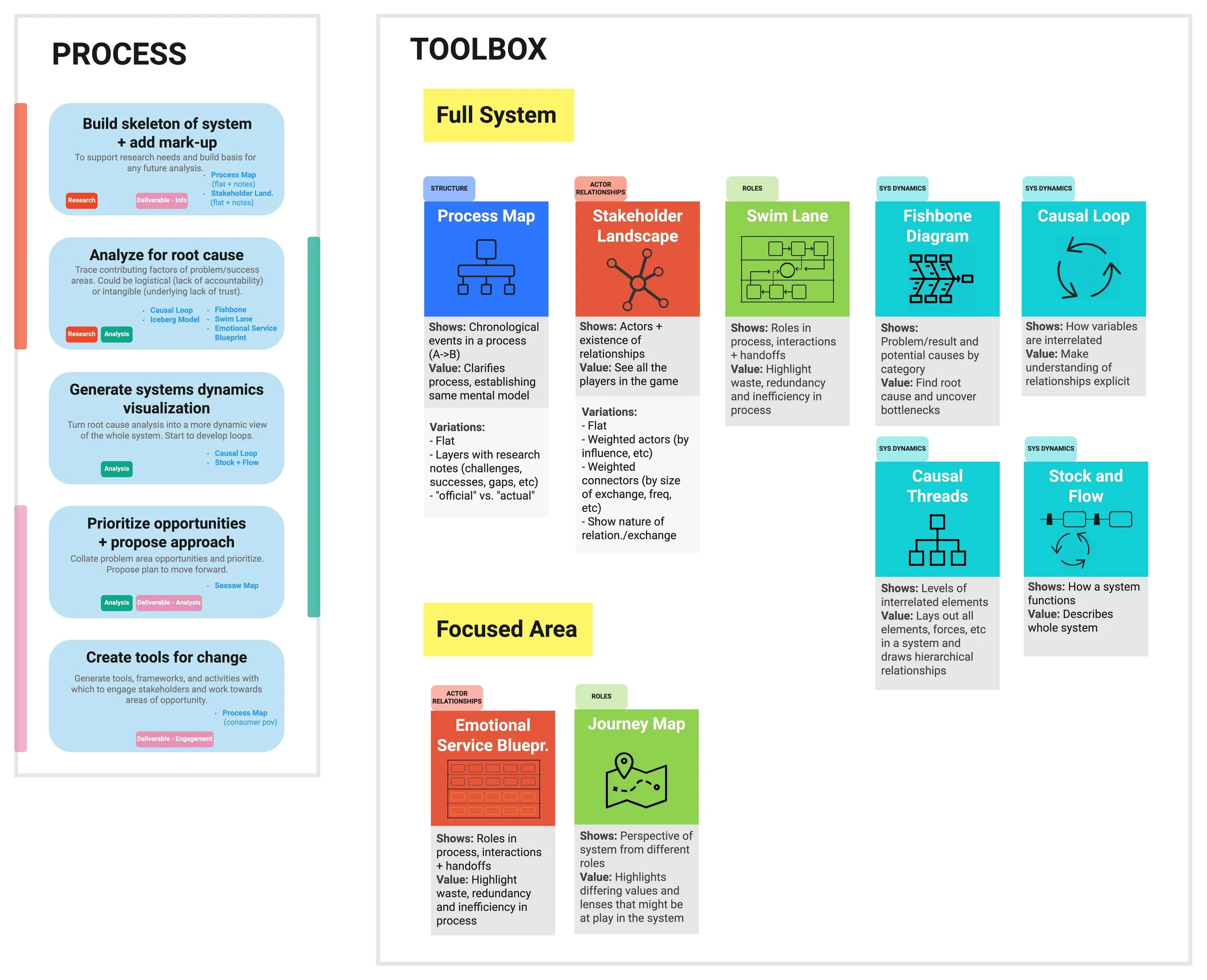
Systems Design Toolbox
The toolbox provides a set of nine basic systems mapping techniques, organized by application. It also includes a basic process outline for systems mapping and identifies when each map type is most useful.
Visual Synthesis Process
The four step process is similar to traditional research synthesis processes in many ways. But unlike traditional synthesis, this process places the most emphasizes on the organization step, which involves iteratively processing the same data. This creates more opportunities to form insights. The following examples are from recent research conducted on vaccine delivery.

Identify
First, identify relevant quotes or data from your data set. There’s no secret method to this step, just make sure you know what question you’re trying to answer. As you work through the data, add chosen quotes to your page in a box.

Categorize
Next, categorize your data by type. For this data set red was used for problem areas, green for current solutions or workarounds, blue for relevant stories, and yellow for contextual information. This step will start to give you a sense of the spread of your data.

Organize - L.A.T.C.H. Theory
Next you will organize and reorganize your data to uncover patterns. LATCH theory describes a variety of ways data can be organized – location (L), alphabetical (A), time (T), category (C), and hierarchy (H). Organizing your data in multiple ways can help surface different patterns, so it’s important that this step be done several times using different elements of the L.A.T.C.H. theory.
By Topic
Organizing the data by topic helped give a general sense of what issues were coming up most frequently in our interviews.

Chronologically
For this example the data was also organized chronologically along the lifecycle of a campaign. By categorizing the information this way you have the ability to view your data in a broader sense. Are there a lot of red boxes clustered at a certain area or a certain step in the process? What is the ratio of challenges (red boxes) to solutions (green boxes) in each area? And so on.

By Emerging Theme
Finally, the data was organized by emerging theme, outlining a hierarchical relationship between elements, similar to a theory of change. This helped clarify how the data could build on itself toward a larger outcome.

And many more…
There are endless ways to organize data according to the LATCH theory. The important thing is that you take the time to do multiple reorganizations and allow yourself to view the data from different perspectives.
Analyze
The final step of analysis may happen after all the reorganizations or immediately following each separate organization. At this point you need to take a step back and examine what each separate organization told you about your data. What patterns are emerging?
What narrative is building? Did any organization methods show you conflicting things? Why did that happen? If an interesting insight emerges, you also must ask yourself if the data has told you something real. It may be a consequence of a small data pool.
Systems Design Toolbox
The toolbox provides a set of nine basic systems mapping techniques, organized by application. It also includes a basic process outline for systems mapping, identifying when each map type is most useful.